Infernal Gates
Cover Designer: Jeroen ten berge designed this magnificent cover after reading the manuscript and consulting with me.
Comments about cover design
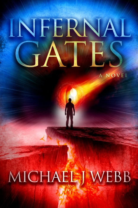
Infernal Gates is a supernatural thriller with lot’s of action and adventure, as well as a dash of romance. The title is taken from a passage in Milton’s Paradise Lost. I wanted a cover that would reflect the key elements of the story. Ethan Freeman must overcome incredible odds and face some of his deepest fears as he is drawn into a ancient conspiracy millennia in the making. The final confrontation between Good and Evil unfolds deep in the belly of the Earth in the Zagros mountains along the Iran/Iraq border at the gates of an Angelic Prison known as The Abyss. A comet portends the evil’s resurrection, and I wanted it to be the “eye” of the demonic darkness contained in The Abyss looking for a way out. Jeroen took my ideas and did a fabulous cover..

Very eye catching
Hard decision in this group of covers there were a couple I really liked. This ones colors and the way it catches the eye with the flames coming up beneath the person silhouetted on the cliffs made me choose it. Good job to the artist.
This cover is awesome – it almost looks hot to touch! Compelling.
Excellent cover! It’s a captivating design with brilliant display of colors. Catches
you eye immediately.
I find this cover so intriguing, it definitely makes me want to pick it up. The colors are incredible and the eye as the background picture, very attention grabbing. Great cover.
I love the red and blue hues on the cover, and the title matches the feeling of the cover — makes me want to pick up the book and read it.
Congratulations! This cover has made it to the finals! Vote for this cover by commenting about what you like about it, and by sharing on Twitter, Facebook and Pinterest using the links above. The more shares, the more votes this cover will get!
Winners are determined by number of comments (one or two word comments don’t count) and combined number of shares. Please only share once a day, we don’t want to spam any social media!
I love that all the colors have a purpose in leading me to have an understanding of the book’s purpose and message before I read a word.
I love this cover – the color catches your eye and draws you in for a closer look at it.
Eye catching cover!
AWESOME Cover! It caused me to pause and want to know more, like on an intellectual level rather than an emotional level. It spoke volumes letting me know this book is going to challenge me rather than sleaze me.AWESOME Cover! It caused me to pause and want to know more, like on an intellectual level rather than an emotional level. It spoke volumes letting me know this book is going to challenge me rather than sleaze me.
Wow. Nice use of color.
I love the colours in this cover. The eye is the centre gives a “Lord of the Rings” sort of feel. Obviously going to be a thrilling read.